VirTra builds law enforcement and military training simulators used by agencies across the country and around the world. Their content library had grown to nearly 1,000 training scenarios but when a customer asked "does your system come with active shooter training?" during a demo, the honest answer was: let me get back to you.
Company
VirTra
Year
2025
Platform
Web
Role
Product Design • UX/UI
Scope of work

The Gold Master Spreadsheet: VirTra's source of truth for nearly 1,000 training scenarios, maintained manually across teams.
My Role

Early wireframe exploring the content browser layout.

Prototype flow across 3 rounds of stakeholder testing.
Sales Team
The primary users and ultimate decision makers. Their real-world demo breakdowns defined the requirements, not assumptions, but actual gaps in live conversations.
Head of Content
Resource and decision maker. Deep knowledge of the library's structure and inconsistencies made them critical to the taxonomy audit and content organization work.
Content Team
Produced and standardized the visual assets: thumbnails, trailers, and metadata to spec. Their work made the visual-first approach actually viable at scale.
Product Manager
Early concepts and product direction. Long tenure at VirTra provided valuable institutional knowledge on what had been tried before and why.
Development Team
Handoff and implementation. Worked closely to ensure design system components translated cleanly into the build.
CEO
Final sign-off. Presented to directly during design reviews, including the visual discovery debate that shaped the product's core direction.
I drove the project, setting up syncs, leading design reviews, and keeping stakeholders aligned from research through handoff.
This wasn't a project where direction came from above. The problem needed to be surfaced and shaped before it could be solved. That meant getting the right people in the room early, asking the right questions, and building enough shared understanding that decisions could move fast when they needed to.
Principles first
Good design doesn't start with screens. It starts with understanding the problem well enough that the right solution becomes obvious.

Search & Filter
The filter panel was the heart of the tool. Sales reps could narrow down by simulator compatibility, category, language, use-of-force options, and more, with a live count updating in real time to show exactly how many scenarios matched. No waiting, no guessing, no follow-up emails.
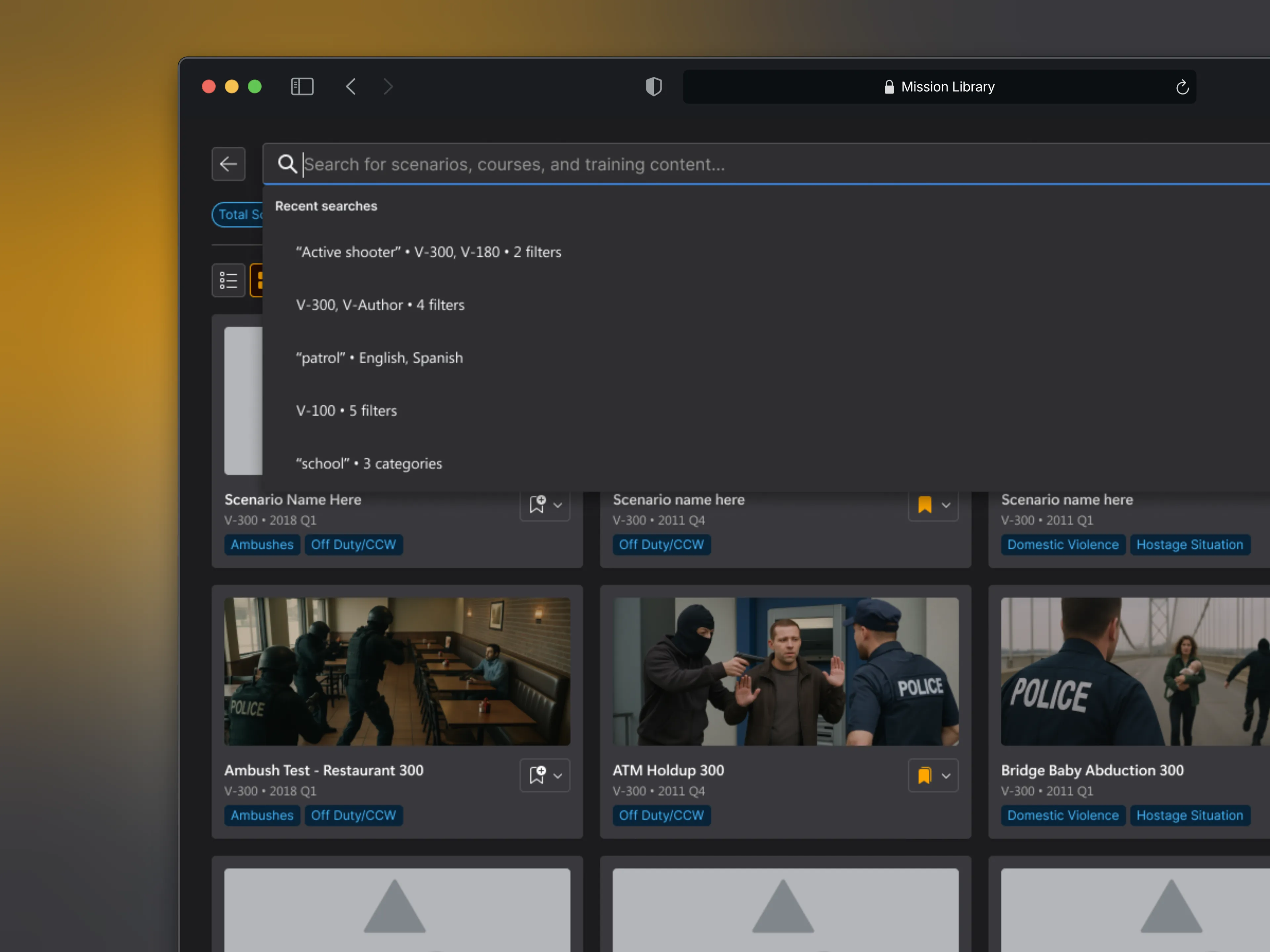
Search with recent queries surfaced for faster repeat lookups.
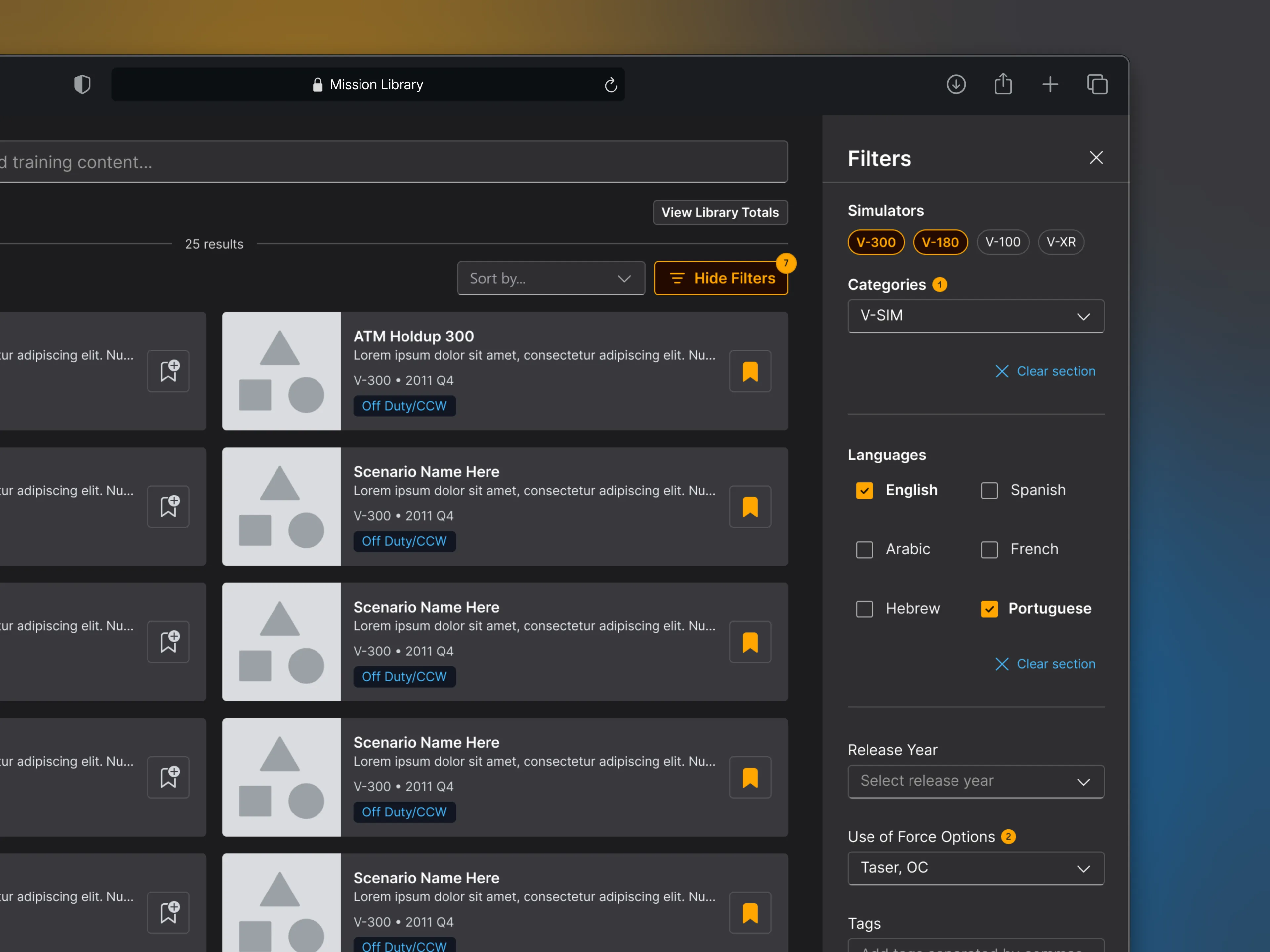
Filter panel with live result count updates instantly.
Custom Lists
Sales reps could build and save custom lists ahead of a call, curating content around a specific customer's training interests before the conversation started. It kept demos focused and personal. It was also the foundation for customer-facing course building and custom playlists planned for the next phase of the product.
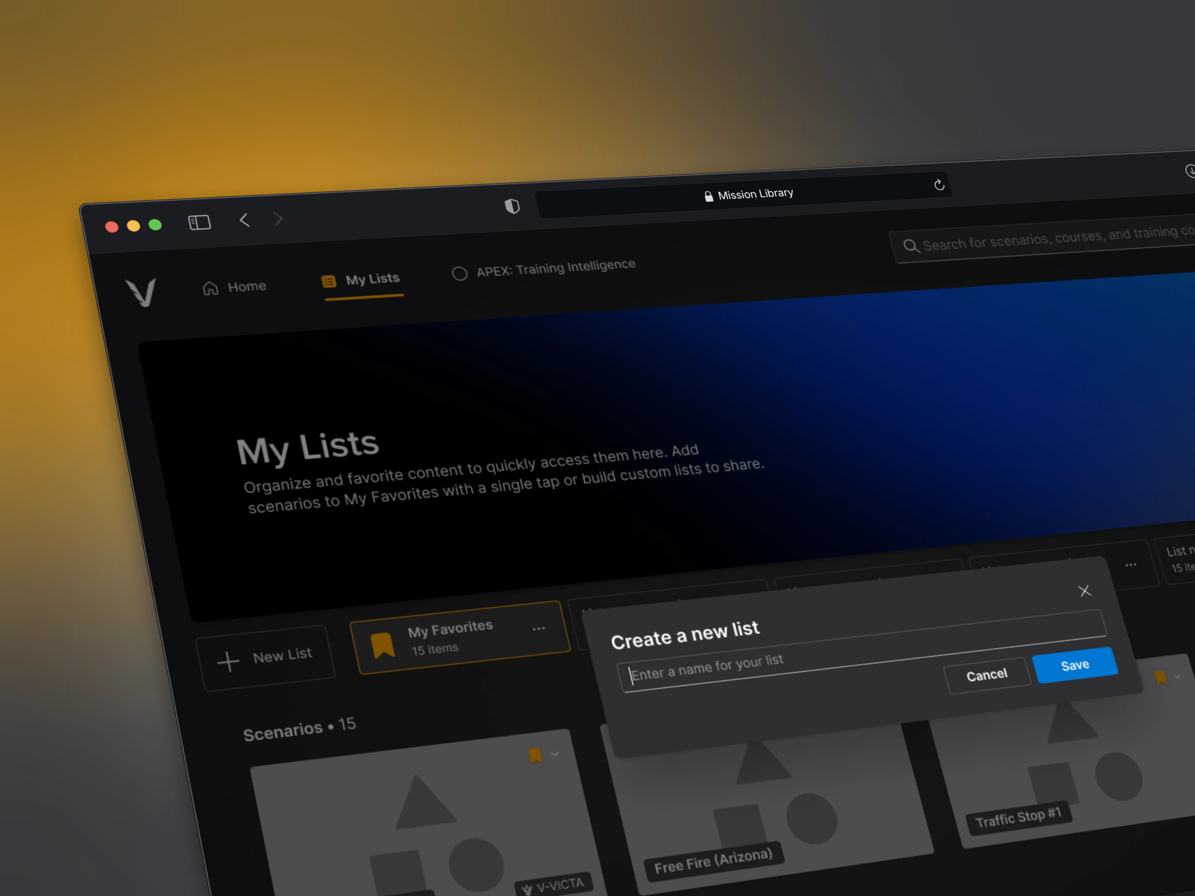
Creating a new list to curate content for a customer demo.
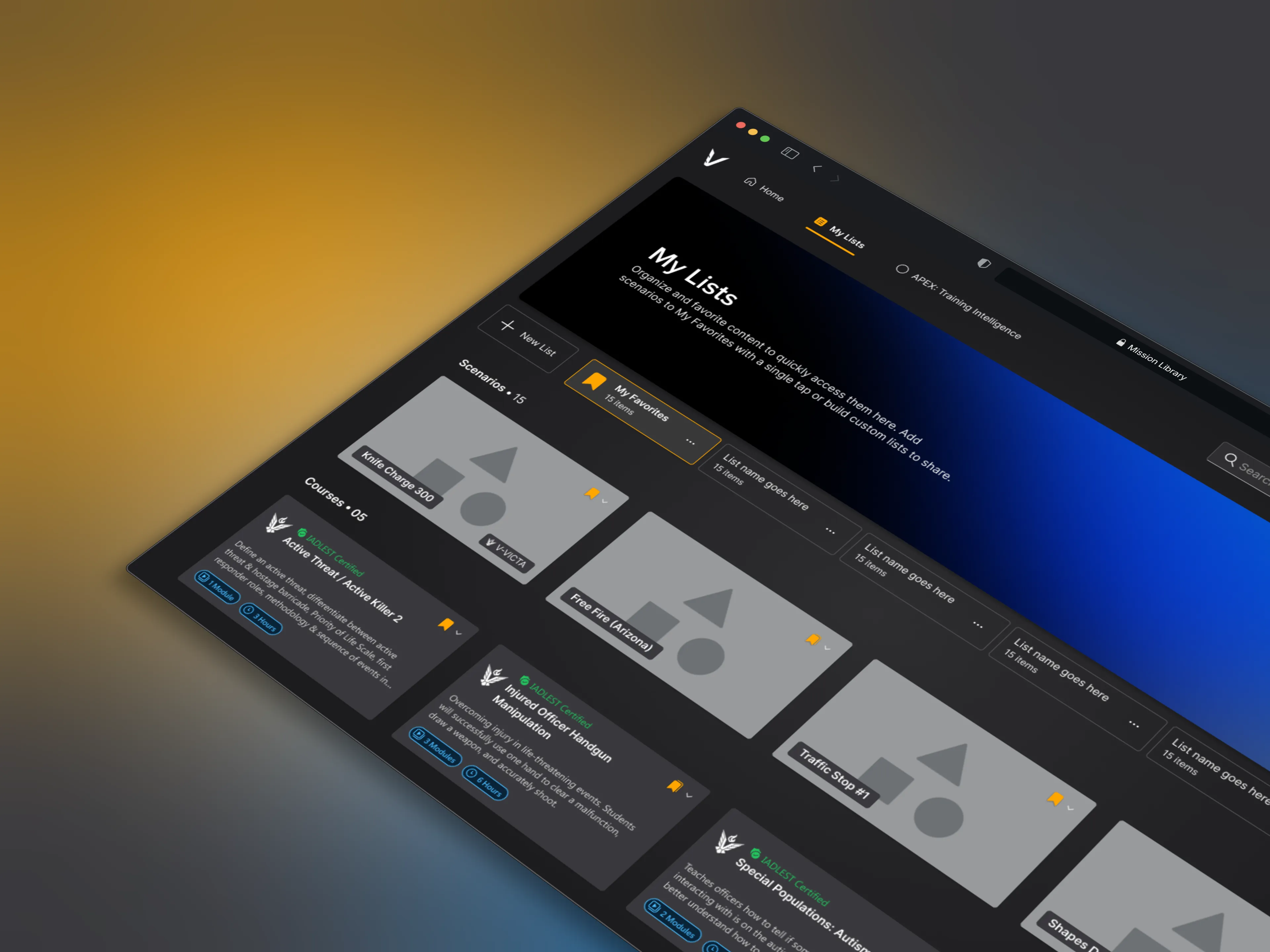
My Lists view with saved and favorited scenarios.
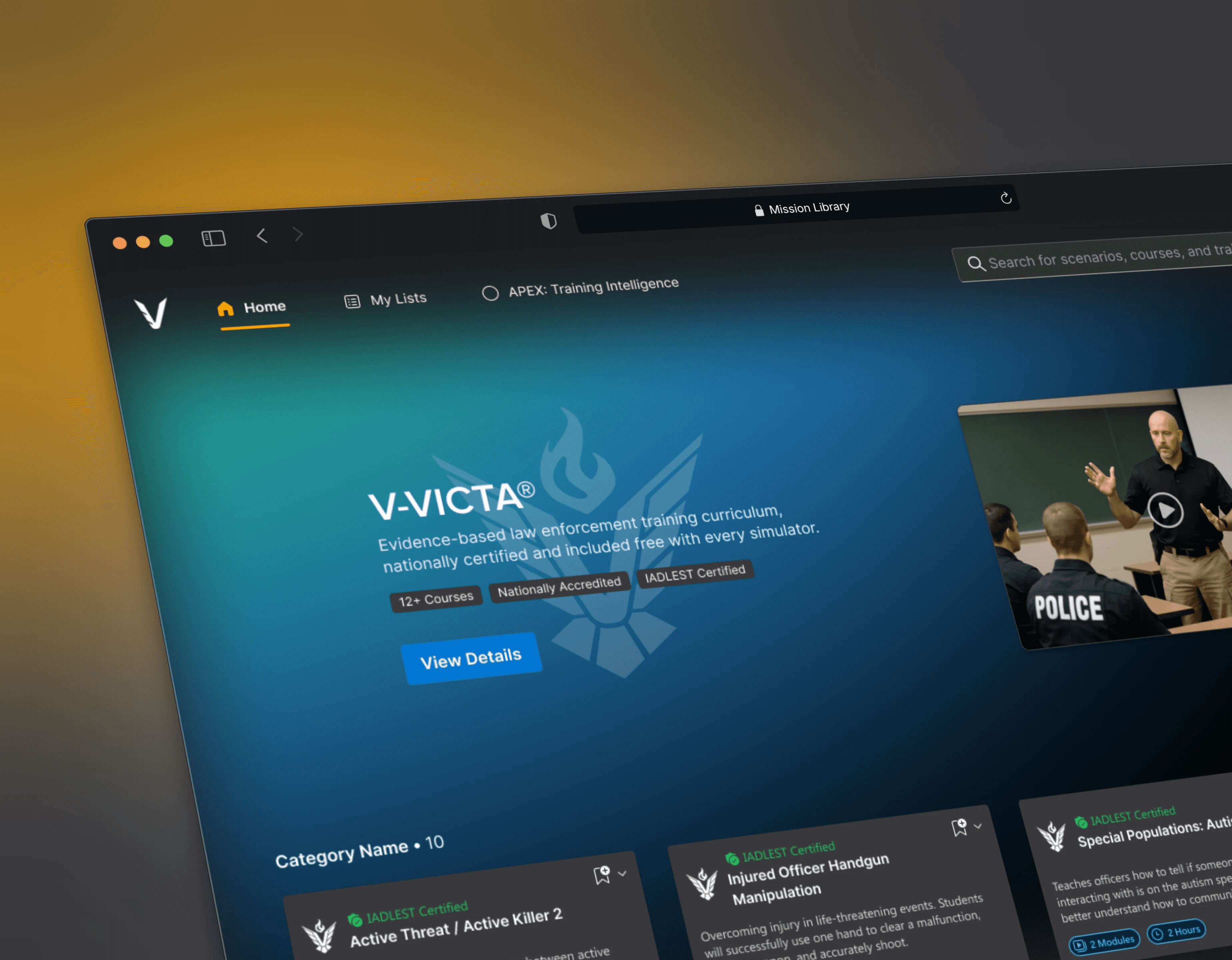
Home & Discovery
The home screen led with what mattered most. Featured simulators, new and upcoming content, and recently added scenarios. Rather than dropping users into a blank search, the home screen gave immediate context and surfaced content worth knowing about.

The home screen leads with featured simulators and recently added content. Giving users immediate context & discovery.
Scenario Detail View
Every scenario had a dedicated detail view surfacing everything a sales rep or customer needed. Duration, tags, capabilities, available languages, and V-VICTA certification status. Information that previously required a Content team lookup was now one click away.
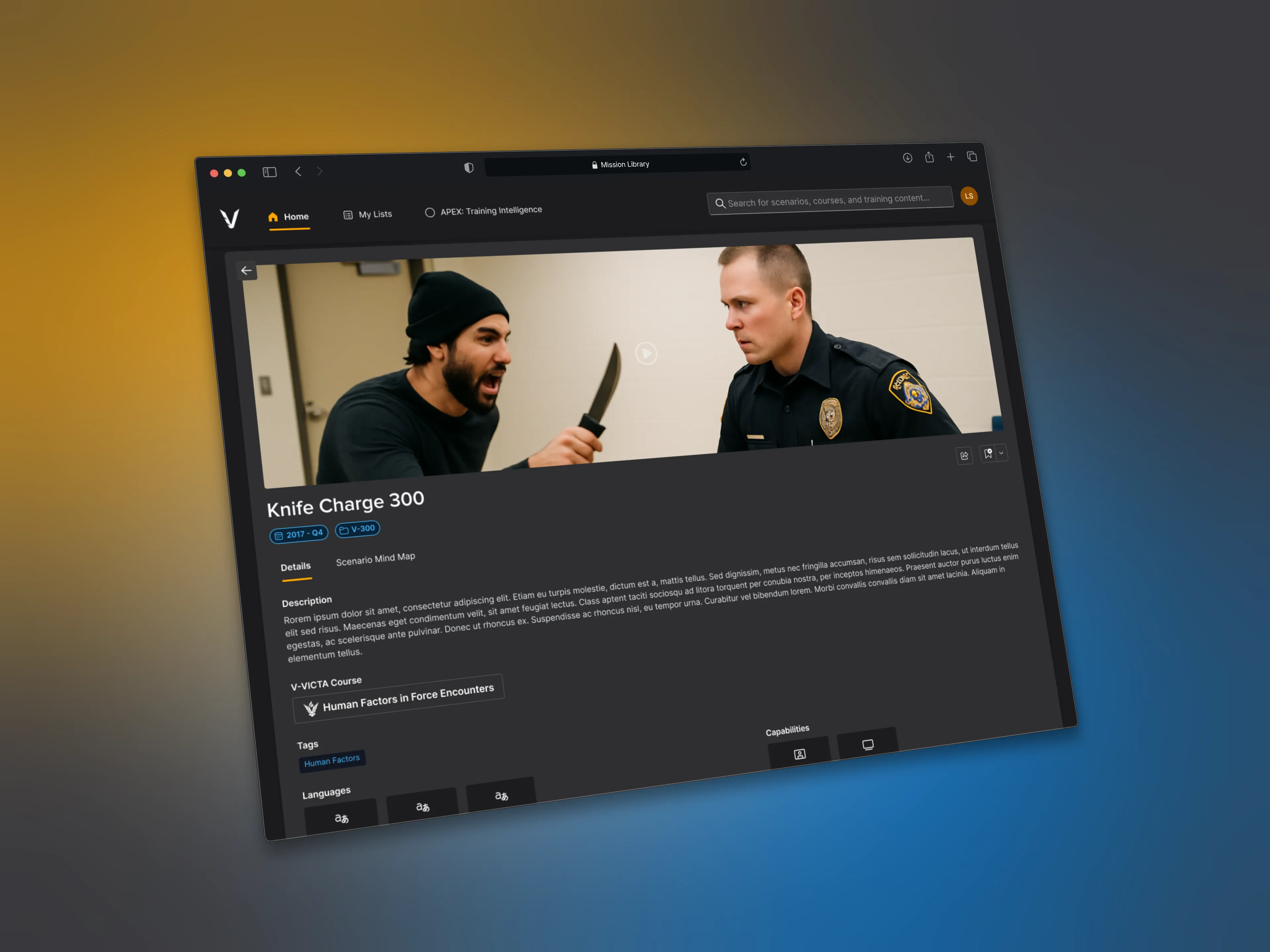
Video scenario details: tags, languages, and capabilities.

V-VICTA details: scenarios, objectives, and course documents.
V-VICTA Product Page: A key differentiator that sales could now demonstrate without a system running.

